CaseStudy
CaseStudy
CaseStudy
Unotek Dimensi Mandiri
Unotek Dimensi Mandiri
Unotek Dimensi Mandiri
UIUX Design | Landing Page
UIUX Design | Landing Page
UIUX Design | Landing Page
Objective
Objective
Objective
Showcases core services and products with a modern, interactive interface that ensures intuitive navigation, clear content hierarchy, and quick access to relevant solutions.
Showcases core services and products with a modern, interactive interface that ensures intuitive navigation, clear content hierarchy, and quick access to relevant solutions.
Showcases core services and products with a modern, interactive interface that ensures intuitive navigation, clear content hierarchy, and quick access to relevant solutions.
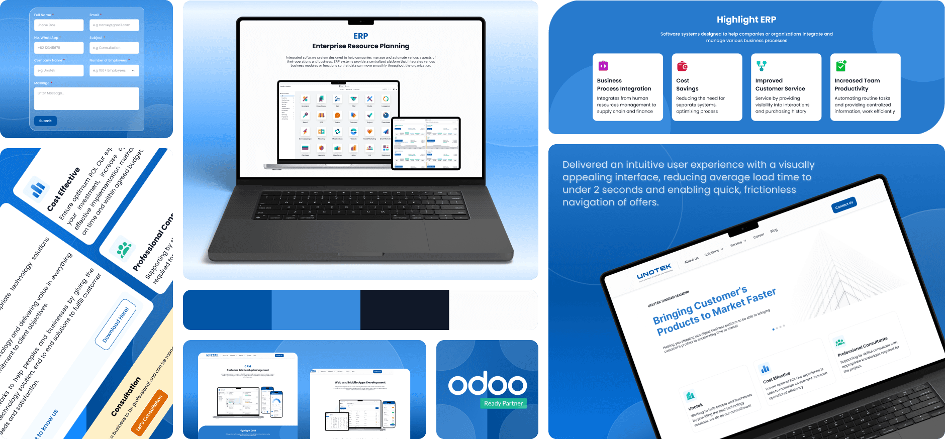
Achievement
Achievement
Achievement
Delivered an intuitive user experience with visually appealing interface, reducing average load time to under 2 sec and enabling quick, frictionless navigation of offers.
Delivered an intuitive user experience with visually appealing interface, reducing average load time to under 2 sec and enabling quick, frictionless navigation of offers.
Delivered an intuitive user experience with visually appealing interface, reducing average load time to under 2 sec and enabling quick, frictionless navigation of offers.
How this project started?
How this project started?
The project began when Unotek approached me with the goal of modernizing their company profile website. They wanted a digital presence that not only reflected their credibility as a technology solution provider but also communicated their services more clearly to potential clients.
The project began when Unotek approached me with the goal of modernizing their company profile website. They wanted a digital presence that not only reflected their credibility as a technology solution provider but also communicated their services more clearly to potential clients.
The project began when Unotek approached me with the goal of modernizing their company profile website. They wanted a digital presence that not only reflected their credibility as a technology solution provider but also communicated their services more clearly to potential clients.
Pain Point
Pain Point

Unclear Information Structure
Unclear Information Structure
The content on the previous website was not organized in a way that guided users effectively. Important details about the company, services, and solutions were buried or scattered.
The content on the previous website was not organized in a way that guided users effectively. Important details about the company, services, and solutions were buried or scattered.
The content on the previous website was not organized in a way that guided users effectively. Important details about the company, services, and solutions were buried or scattered.

Limited User Guidance
Limited User Guidance
Navigation and interaction cues were not intuitive, leading users to spend more time figuring out where to go rather than absorbing Unotek’s message. This resulted in potential drop-offs and lower engagement.
Navigation and interaction cues were not intuitive, leading users to spend more time figuring out where to go rather than absorbing Unotek’s message. This resulted in potential drop-offs and lower engagement.
Navigation and interaction cues were not intuitive, leading users to spend more time figuring out where to go rather than absorbing Unotek’s message. This resulted in potential drop-offs and lower engagement.

Not Optimized for Conversion
Not Optimized for Conversion
Call-to-action elements such as “Contact Us” or “Learn More” were either placed ineffectively or visually understated, reducing opportunities for user engagement and business inquiries.
Call-to-action elements such as “Contact Us” or “Learn More” were either placed ineffectively or visually understated, reducing opportunities for user engagement and business inquiries.
Call-to-action elements such as “Contact Us” or “Learn More” were either placed ineffectively or visually understated, reducing opportunities for user engagement and business inquiries.
Customer Journey
Customer Journey


Problem Statment
Problem Statment
Clearer information structure was essential to help users absorb content faster and feel confident in exploring the company’s capabilities.
Clearer information structure was essential to help users absorb content faster and feel confident in exploring the company’s capabilities.
Clearer information structure was essential to help users absorb content faster and feel confident in exploring the company’s capabilities.
The Website Does Not Support Brand Image
The Website Does Not Support
Brand Image
The Website Does Not Support
Brand Image
The existing digital presence did not reflect the maturity and credibility of a technology service provider. Users judged the company’s professionalism based on their first interaction with the website, and the experience they encountered felt outdated and unintuitive.
This created a mismatch between the company’s actual expertise and how it was perceived online. The website needed to deliver a more modern, intuitive, and well-organized experience that reinforced trust, supported decision-making, and aligned with Unotek’s brand values.
The Website Failed to Communicate Value
The Website Failed to
Communicate Value
The Website Failed to
Communicate Value
At a strategic level, the previous website did not effectively communicate Unotek’s positioning, capabilities, and value proposition. Users arrived on the site but were unable to quickly understand what the company does, why it matters.
This was not a matter of layout or UI inconsistency alone it was a communication issue. The website needed a more intentional narrative, clearer content hierarchy, and a structure that guided users toward understanding Unotek's identity and solutions with confidence.
Design Process
Design Process
Clearer information structure was essential to help users absorb content faster and feel confident in exploring the company’s capabilities.
Clearer information structure was essential to help users absorb content faster and feel confident in exploring the company’s capabilities.
Clearer information structure was essential to help users absorb content faster and feel confident in exploring the company’s capabilities.


UI Kit
UI Kit
The UI Kit was designed to ensure visual consistency across the website. allowing the interface to remain cohesive, scalable, and easy to maintain.
The UI Kit was designed to ensure visual consistency across the website. allowing the interface to remain cohesive, scalable, and easy to maintain.
The UI Kit was designed to ensure visual consistency across the website. allowing the interface to remain cohesive, scalable, and easy to maintain.

